Typography
The choice of typography extends the voice and tone of the brand. Choosing the right combination of fonts can support the subtext of a message, whether it is a formal communication or more casual piece. It is important that all ITS branded communications adhere to the typography guidelines in order to build brand consistency.
Primary typeface
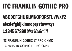 Franklin Gothic LT Pro (uppercase) is the primary typeface for all ITS branded materials.
- The compressed and condensed weights must be used wherever possible to extend the ITS brand. Book, Medium and Demi Compressed weights are acceptable.
- Franklin Gothic LT Pro is a available for free with the Adobe Creative Cloud license and Microsoft Office Suite.
- If unavailable, an acceptable substitute is the free Google font, Open Sans Condensed Bold (Open Sans variable font family), with a condensed width.

Uses
- Headlines (uppercase preferred with shorter lines of text)
- Sub-headlines
- Display
- Callouts and quotes
- Graphics
 Secondary typeface
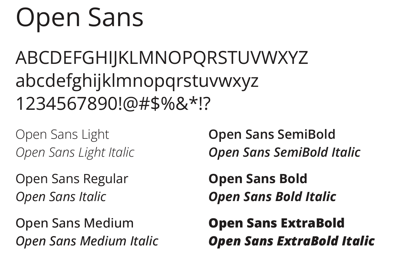
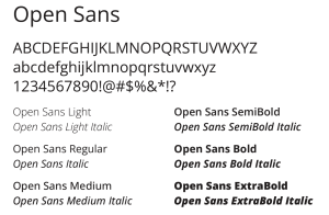
- Open Sans is a clean, modern font that pairs nicely with the condensed versions of Franklin Gothic LT Pro.
- This font is easy to read online, making it an excellent choice for digital documents.
- All weights are acceptable.
- Open Sans is a free Google font, available for download as a variable font.
Uses
- Body copy
- Sub-headlines
- Callouts and quotes
- Graphics
 Tertiary typeface
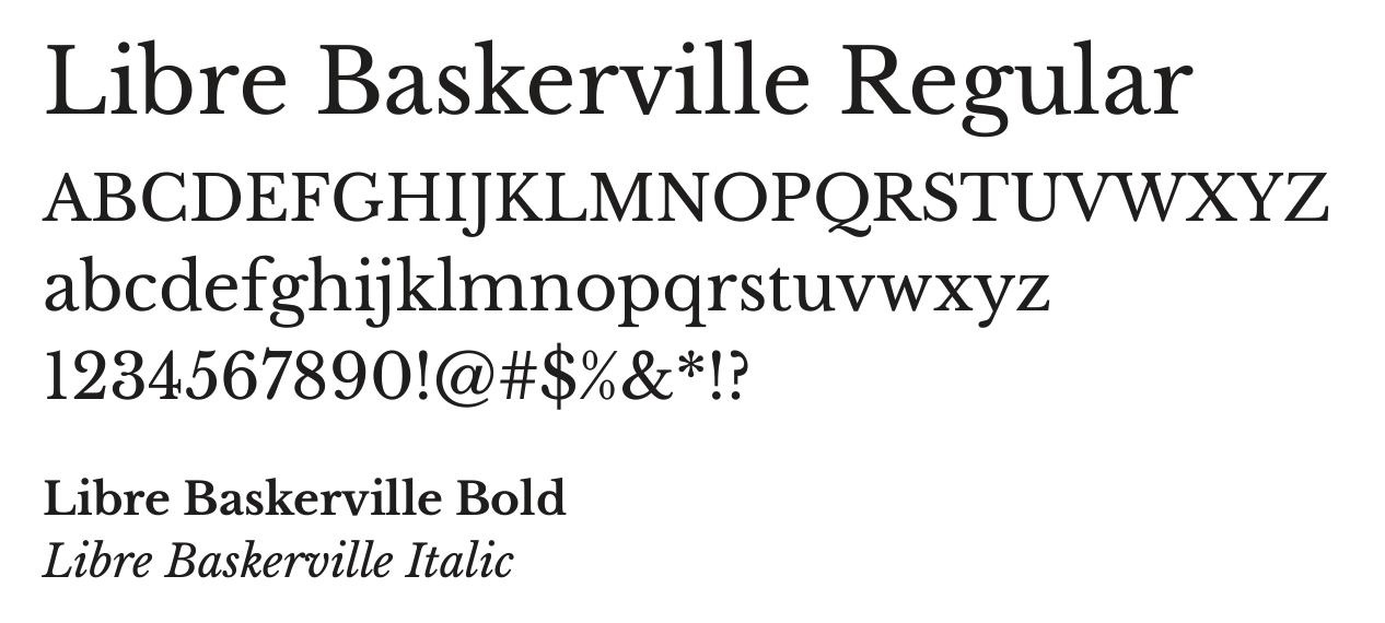
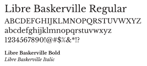
- While Bembo Std is the official University typeface, LibreBaskerville is preferred for its clarity online.
- It is an acceptable substitute for print communications as well.
- Libre Baskerville should be used mainly in more formal communications or to add contrast and softness when combined with the Primary and Secondary typefaces.
Uses
- Headlines
- Formal communications
Text hierarchy
These examples of combining the headline, sub-headline and body copy fonts demonstrate how the proper combination of fonts can draw attention and add interest to the message. Adding color to a headline or sub-headline can further highlight the text.